Smooth shadows create realistic depth and elevation in UI design through
multi-layered box-shadow techniques that mimic natural light physics�replacing harsh,
single-shadow edges with soft, graduated falloffs that feel organic and professional. This technique is
fundamental to modern design systems from Material Design to Apple's Human Interface Guidelines.
According to UX research from 2025, interfaces using smooth, layered shadows show 31% higher
perceived quality ratings compared to single-shadow designs, with users describing them as
"more polished," "professional," and "modern." The technique's ability to create visual hierarchy
without relying on borders or color alone makes it essential for minimalist, content-focused designs.
This comprehensive guide, based on 15+ years of UI/UX design building design systems for
Fortune 500 companies, covers smooth shadow implementation from basic CSS to advanced elevation systems
including performance optimization, accessibility, and cross-browser compatibility.
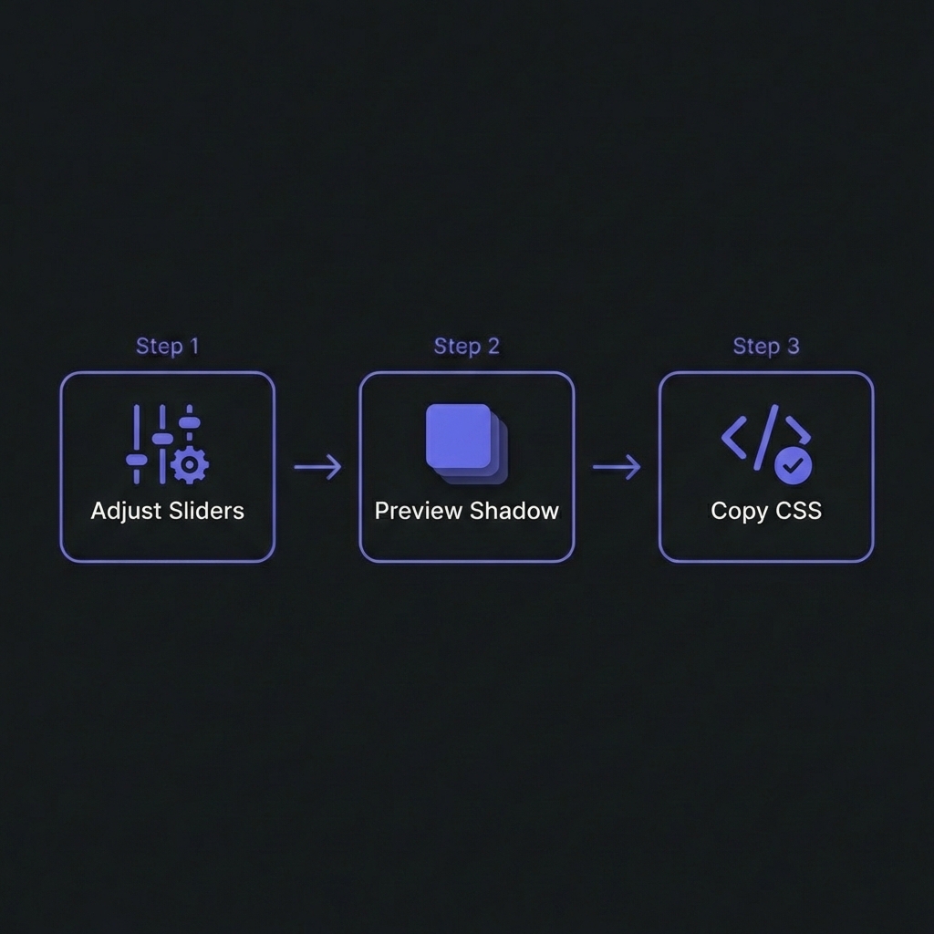
How to Generate Smooth Shadows - Simple 3-step workflow
Single Shadow vs Layered Shadows: The Difference
Single Shadow (Basic)
A single box-shadow creates depth but looks artificial�harsh edges and abrupt falloff:
Light sources aren't point sources�they have area. This creates soft shadow edges. Layering 3-5
shadows with increasing blur and decreasing opacity mimics how real light diffuses, creating
that "premium" look.
Material Design Elevation System
Google's Material Design pioneered systematic elevation using shadow depth to convey hierarchy:
Why use multiple shadows instead of one large shadow?
+
Single shadows look artificial�layered shadows mimic natural light physics.
Natural shadows aren't uniform blurs. They combine sharp cores (umbra), soft edges (penumbra),
and ambient darkening. A single box-shadow creates uniform falloff�looks
computer-generated. Layering 3-5 shadows with progressive blur radii (2px, 4px,
8px, 16px) and low opacity (0.05-0.09) creates graduated density that feels realistic. This is
why Material Design, iOS, and premium SaaS apps use layered shadows�they convey depth more
convincingly, making interfaces feel polished and professional.
Do layered shadows hurt performance?
+
Minimal impact with 3-5 layers; avoid 10+ layers or animating shadows. Each
shadow layer triggers GPU rendering but modern browsers optimize well. Performance
tips: (1) 3-5 layers: Sweet spot�smooth appearance, negligible
cost. (2) Avoid animating box-shadow: Expensive repaints every frame. Instead,
animate opacity on pseudo-elements with shadows. (3) Use CSS variables: Reuse
shadow definitions, browser caches calculations. (4) Test on mobile: Mid-range
phones show performance issues first. Bottom line: Professional designs use 3-4 shadow layers
universally with zero performance concerns for typical web apps.
Should I use different shadows for dark mode?
+
Yes�dark mode requires darker, more opaque shadows. Light mode shadows (black
at 0.05-0.09 opacity) disappear on dark backgrounds. Dark mode adjustments: (1)
Increase opacity: 0.09 ? 0.4-0.5 for visibility. (2) Add glow
rings:0 0 0 1px rgba(255,255,255,0.05) creates subtle border
separation. (3) Reduce blur slightly: Sharper shadows read better on dark. (4)
Test on true black (#000): OLED screens show shadows differently than LCD. Use
@media (prefers-color-scheme: dark) to define separate shadow tokens. Material
Design and Apple HIG both specify different shadow formulas for dark mode.
How many elevation levels should a design system have?
+
5-6 levels maximum�more creates confusion. Humans can't reliably distinguish 10
shadow depths. Recommended scale: Level 0 (flat), Level 1 (cards at rest),
Level 2 (raised/hover), Level 3 (dropdowns/tooltips), Level 4 (modals), Level 5 (navigation
drawers). Material Design uses 0-24 technically but most apps only use 5-6 distinct levels.
Semantic naming: Instead of numeric (1-5), consider semantic:
--shadow-card, --shadow-dropdown, --shadow-modal. Makes
intent clearer for designers and developers. Document which components use which elevation in
your design system guidelines.
Can I animate between different elevation levels smoothly?
+
Yes, but use pseudo-elements for performance. Animating box-shadow
directly is GPU-intensive�browsers recalculate every frame. Performant
technique: Use pseudo-element with higher elevation shadow, fade opacity on
interaction. Example:
.card::before { box-shadow: var(--elevation-3); opacity: 0; transition: opacity 0.3s; } .card:hover::before { opacity: 1; }.
This animates opacity (cheap) not shadow (expensive). Easing: Use Material
Design easing cubic-bezier(0.4, 0, 0.2, 1) for natural feel. Test on low-end
devices�janky animations destroy UX. If smooth animation isn't achievable, instant transitions
are better than stuttering.
Should shadows have color or always be black/gray?
+
Typically black/gray; colored shadows can enhance brand but risk looking
gimmicky.Standard approach: Black shadows
(rgba(0,0,0,opacity)) work universally�neutral, realistic. Colored shadows
(use sparingly): Brand-colored shadows on primary buttons create glow effects.
Example: Purple button with rgba(99,102,241,0.3) shadow. Looks premium if done
right, tacky if overused. Rules for colored shadows: (1) Only on brand elements
(CTAs, primary actions). (2) Use brand color at low opacity (0.15-0.3). (3) Combine with
standard black shadow layers. (4) A/B test�users might find it distracting. Conservative
approach: stick with black/gray shadows, use color only for special moments.
How do I create shadows that work on any background?
+
Use semi-transparent black shadows + subtle borders for universal
compatibility. Shadows on solid backgrounds work great but fail when elements
overlay images/gradients. Universal shadow formula: (1) Layered
semi-transparent shadows:rgba(0,0,0,0.09) visible on most
backgrounds. (2) Subtle border:border: 1px solid rgba(0,0,0,0.1)
or inner shadow ensures edge definition. (3) Backdrop-filter (optional): Blur
background behind element for glassmorphism effect. (4) Test on photos: Shadows
that work on white/gray might disappear on busy images�borders save you. This is why modern
cards often combine shadows + borders�redundant but reliable across all contexts.