CSS Gradient Generator: The Complete Guide to Beautiful Gradients (2026)

Table of Contents
CSS gradients are one of the most powerful tools in a web designer's arsenal. They allow you to create smooth transitions between two or more colors, adding depth, dimension, and visual interest to any element. Unlike image-based gradients, CSS gradients are resolution-independent, infinitely scalable, and incredibly lightweight.
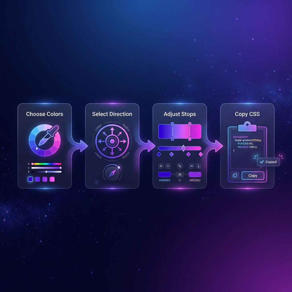
Our free CSS Gradient Generator makes creating beautiful gradients effortless. With a visual interface, live preview, and one-click CSS export, you can design stunning gradients in seconds—no design experience required.
Types of CSS Gradients
CSS supports three main types of gradients, each serving different design purposes:
- Linear Gradients — Colors transition along a straight line
- Radial Gradients — Colors radiate outward from a center point
- Conic Gradients — Colors rotate around a central point (like a pie chart)
Linear Gradients Deep Dive
Linear gradients are the most commonly used type. They transition colors in a straight line—horizontal, vertical, or at any angle you specify.
/* Basic linear gradient */
background: linear-gradient(to right, #667eea, #764ba2);

/* With angle (degrees) */
background: linear-gradient(135deg, #f093fb, #f5576c);

/* Multiple color stops */
background: linear-gradient(to right,
    #ff6b6b,
    #feca57,
    #48dbfb,
    #ff9ff3
);
Direction Keywords
to right— Left to right (0deg)to left— Right to left (180deg)to bottom— Top to bottom (default, 180deg)to top— Bottom to top (0deg)to bottom right— Diagonal corner-to-corner
Pro Tip: The 45° Rule
Gradients at 45° angles often look more dynamic and modern than straight horizontal or vertical gradients. Try 135° for a subtle, sophisticated look.
Radial Gradients
Radial gradients create circular or elliptical color transitions that radiate outward from a center point. They're perfect for spotlight effects, buttons, and decorative backgrounds.
/* Basic radial gradient */
background: radial-gradient(circle, #667eea, #764ba2);

/* Ellipse with custom position */
background: radial-gradient(
    ellipse at top left,
    #a8edea,
    #fed6e3
);

/* Sized radial gradient */
background: radial-gradient(
    circle closest-side at 50% 50%,
    #ffecd2,
    #fcb69f
);
Shape and Size Keywords
circle— Perfect circle shapeellipse— Stretched circle (default)closest-side— Gradient extends to the nearest edgefarthest-corner— Gradient extends to the farthest corner
Create Beautiful Gradients
Use our visual generator with live preview and instant CSS export.
Open Gradient Generator →Conic Gradients
Conic gradients (also called angular gradients) rotate colors around a center point, creating pie-chart-like effects. They're great for creating loading spinners, color wheels, and unique decorative effects.
/* Basic conic gradient (color wheel) */
background: conic-gradient(
    red,
    yellow,
    lime,
    aqua,
    blue,
    magenta,
    red
);

/* Pie chart effect */
background: conic-gradient(
    #667eea 0% 25%,
    #764ba2 25% 60%,
    #f093fb 60% 100%
);
Understanding Color Stops
Color stops are the secret to creating professional gradients. They define where each color appears along the gradient and how colors transition between each other.
/* Equal distribution (default) */
background: linear-gradient(#ff6b6b, #4ecdc4);

/* Custom positions */
background: linear-gradient(
    #ff6b6b 0%,
    #ff6b6b 30%,  /* Solid until 30% */
    #4ecdc4 70%,  /* Transition area */
    #4ecdc4 100%
);

/* Hard color stops (no transition) */
background: linear-gradient(
    #ff6b6b 50%,
    #4ecdc4 50%
);
Best Practices for CSS Gradients
1. Use Harmonious Colors
Colors that are close on the color wheel create smooth, professional gradients. Complementary colors can work but require careful positioning.
2. Avoid Gray Zones
When mixing certain colors (like purple and yellow), the middle can appear muddy gray. Add an intermediate color or adjust positions to avoid this.
3. Consider Text Readability
If placing text over gradients, ensure sufficient contrast. Test with both light and dark text to see which works better.
4. Add Fallback Colors
Always include a solid background-color as a fallback for browsers that don't support
gradients (rare today, but good practice).
5. Use CSS Custom Properties
Define gradient colors as CSS variables for easy theming and consistency across your project:
:root {
    --gradient-start: #667eea;
    --gradient-end: #764ba2;
}

.button {
    background: linear-gradient(
        135deg,
        var(--gradient-start),
        var(--gradient-end)
    );
}
Gradient Trends in 2026
Aurora Gradients
Inspired by the northern lights, these gradients use soft, flowing transitions between vibrant purples, blues, and greens.
Mesh Gradients
Complex multi-point gradients that create organic, blob-like shapes. While not natively supported in CSS, they can be achieved with overlapping radial gradients.
Dark Mode Optimized
Subtle gradients using dark colors that add depth without overwhelming the eye in dark theme interfaces.
Glassmorphism Combinations
Gradients paired with blur effects and transparency for the popular glass-like appearance.
Duotone Effects
Two-color gradients applied as overlays on images for a striking, modern look.
Animating CSS Gradients
CSS doesn't allow direct transition of gradient colors, but there are creative workarounds that give the appearance of animated gradients — widely used in modern UIs like Stripe and Linear.
The Background-Position Trick
Create a gradient larger than the element, then animate background-position. This creates a
"sliding" gradient effect popular in loading screens and hero banners:
.animated-gradient {
    background: linear-gradient(
        270deg,
        #ff6b6b, #feca57, #48dbfb, #ff9ff3
    );
    background-size: 400% 400%;
    animation: gradientShift 8s ease infinite;
}

@keyframes gradientShift {
    0%   { background-position: 0% 50%; }
    50%  { background-position: 100% 50%; }
    100% { background-position: 0% 50%; }
}
CSS @property for Native Color Animation
Modern Chrome and Edge support @property which lets you register custom properties as typed
values — enabling direct gradient color animation:
@property --color-stop-1 {
    syntax: '<color>';
    initial-value: #ff6b6b;
    inherits: false;
}

@property --color-stop-2 {
    syntax: '<color>';
    initial-value: #4ecdc4;
    inherits: false;
}

.animate-gradient {
    background: linear-gradient(var(--color-stop-1), var(--color-stop-2));
    transition: --color-stop-1 1s, --color-stop-2 1s;
}

.animate-gradient:hover {
    --color-stop-1: #667eea;
    --color-stop-2: #764ba2;
}
Gradient Accessibility & Contrast
Beautiful gradients can become a usability problem if text placed over them doesn't have sufficient contrast. Google's Material Design and WCAG 2.1 both require a minimum contrast ratio of 4.5:1 for body text against its background.
The Problem with Gradients and Text
A gradient that starts dark enough for white text might transition to a light color where white text becomes unreadable. The contrast can change across the element. Best practices:
- Use a semi-transparent overlay: Add
background: rgba(0,0,0,0.4)on top of the gradient before placing text - Text shadow: Add
text-shadow: 0 1px 3px rgba(0,0,0,0.6)for better readability - Confine gradients to decorative areas: Keep text on solid color sections, use gradients only for borders, backgrounds without text, or decorative elements
- Test with a contrast checker: Tools like WebAIM's Contrast Checker can verify your text/background combinations
Gradient Performance Tips
CSS gradients are rendered by the GPU and are inherently fast. But there are edge cases where they can hurt performance:
Avoid Animating Large Gradients
Animating background-position on a full-screen gradient triggers the GPU every frame. For
hero sections, consider using a static gradient. Reserve animations for smaller elements like buttons or
badges.
Use will-change Carefully
Adding will-change: background-position tells the browser to optimize the element for
animation. But using it on too many elements can actually hurt performance by consuming excessive GPU
memory.
Reduce Gradient Complexity in Mobile
Mobile GPUs are less powerful. Use media queries to simplify gradients on smaller screens:
/* Complex gradient for desktop */
.hero {
    background: linear-gradient(135deg, #667eea 0%, #764ba2 30%, #f093fb 60%, #f5576c 100%);
}

/* Simplified gradient for mobile */
@media (max-width: 768px) {
    .hero {
        background: linear-gradient(135deg, #667eea, #764ba2);
    }
}
Real-World Gradient Examples
Here's how major companies use gradients in their brand and UI:
- Stripe: Uses subtle multi-color animated gradients in hero sections to convey "modern fintech" — purples, pinks, and blues
- Instagram: Their iconic logo uses a conic-style gradient from yellow-orange to purple-pink
- Linear (task management): Dark glassmorphism UI with subtle purple gradient glows on cards
- Vercel: Minimal white/gray palette with sharp linear gradients for loading states
- GitHub Copilot: Blue-to-purple gradient for the AI assistant branding
Free Gradient Resources
Looking for inspiration? Check out uiGradients.com for curated gradient collections, coolors.co for color palette generation, and css.glass for glassmorphism combinations. Then use our Gradient Generator to instantly create and export the CSS.
Frequently Asked Questions
What's the difference between linear and radial gradients?
Linear gradients transition colors in a straight line—horizontal, vertical, or diagonal. Radial gradients emanate from a center point outward in a circular or elliptical pattern. Linear is best for backgrounds and buttons; radial creates spotlight or depth effects.
How many color stops can I add?
CSS gradients support unlimited color stops. However, for most designs, 2-4 colors work best. Too many colors can look chaotic and increase rendering complexity. Our generator makes it easy to experiment with different numbers.
Do CSS gradients work in all browsers?
Yes! CSS gradients are supported in all modern browsers including Chrome, Firefox, Safari, Edge, and Opera. They've been widely supported since 2012. Our generator produces standard CSS without vendor prefixes.
Can I use gradients for text?
Absolutely! Use background-clip: text and
-webkit-background-clip: text along with color: transparent to
create stunning gradient text. Works in all modern browsers.
Are CSS gradients better than gradient images?
In most cases, yes. CSS gradients are resolution-independent (look sharp on retina displays), require no HTTP requests, can be easily modified in code, and are typically smaller in file size. Use images only for complex textures or artistic effects CSS can't achieve.
Can I animate CSS gradients?
You can't directly animate gradient colors with CSS transitions. However, you can animate
background-position for a shifting effect, or use CSS custom properties with
JavaScript for dynamic color changes. Some browsers support @property for
native color animation.
Is this generator free to use?
100% free. All processing happens client-side in your browser. No signup required, no limitations, and the generated CSS is yours to use in any project—personal or commercial.
Code Formatter © 2026. Professional developer tools built with privacy and performance in mind.