Aspect ratio is more than just a numbers game�it's the fundamental constraint
of every screen we design for. From the cinematic 21:9 ultra-wide monitors to the 9:16 vertical
dominance of TikTok and Instagram Reels, understanding the relationship between width and height is
crucial for modern digital experiences.
In 2026, with Cumulative Layout Shift (CLS) being a major Google Search Ranking factor,
defining aspect ratios properly isn't just an aesthetic choice; it's an SEO necessity. If your images
push content down as they load, your rankings suffer. Mastering the aspect-ratio CSS
property explains to the browser exactly how much space to reserve before a single pixel of image data
arrives.
This guides distills 15 years of responsive design experience into actionable
techniques, formulas, and code snippets that will future-proof your layouts against any screen size.
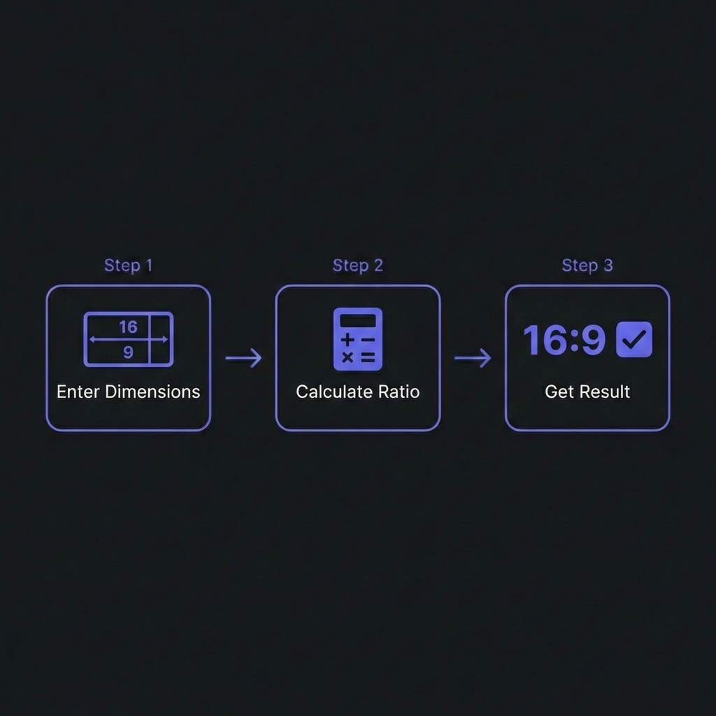
How to Calculate Aspect Ratio - Simple 3-step workflow
What is Aspect Ratio? (The Math)
An aspect ratio describes the proportional relationship between the width and height of an image or
screen. It is usually expressed as two numbers separated by a colon, like 16:9.
Gone are the days of the "padding-hack" (using padding-bottom: 56.25% to force a 16:9
ratio). Since 2021, modern browsers support the native aspect-ratio property, which is
cleaner, more readable, and more robust.
Modern CSS Syntax
/* The Old Way (Padding Hack) */.video-wrapper {
position: relative;
padding-bottom: 56.25%; /* 9/16 = 0.5625 */height: 0;
}
/* The New Way (aspect-ratio) */.card-image {
width: 100%;
aspect-ratio: 16 / 9;
object-fit: cover; /* Prevents stretching */
}
Why object-fit needs aspect-ratio
When you force an element into a specific ratio, the original content might distort. Always pair
aspect-ratio with object-fit: cover (crops to fill) or
object-fit: contain (shrinks to fit) to maintain visual integrity.
Solving Layout Shift (CLS)
Cumulative Layout Shift (CLS) occurs when an image loads and pushes text down, jarring
the user. This happens because the browser doesn't know the image's height until it downloads.
The Fix
By explicitly setting width and aspect ratio (or width and height attributes in HTML), the browser
calculates the required space immediately.
CLS Prevention Pattern
<!-- HTML Attributes (Best Practice) -->
<img
src="hero.jpg"width="800"height=600"alt="Hero Image"style="width: 100%; height: auto;"
>
/* Browser calculates: Ratio = 800/600 = 4:3 *//* Browser reserves 4:3 box based on computed width */
If you are using background images or dynamic content containers, the CSS aspect-ratio
property is your best friend for reserving that space.
Social Media Cheat Sheet 2026
Social platforms are strict about ratios. Wrong dimensions lead to ugly cropping or black bars. Here is
the definitive guide for 2026:
Handling iframe embeds (like YouTube) used to be a nightmare for responsive layouts because
iframes have fixed dimensions. The aspect-ratio property simplifies this drastically.
What is the formula to calculate aspect ratio from resolution?
+
Divide width by Greatest Common Divisor (GCD) and height by GCD. For example,
1920x1080: The GCD of 1920 and 1080 is 120. 1920/120 = 16. 1080/120 = 9. Thus, 16:9. For decimal
ratios, simply divide width by height (1920/1080 = 1.77:1).
Does aspect-ratio work for non-replaced elements (like divs)?
+
Yes! This is one of its best features. You can give a simple
<div> a width: 50% and aspect-ratio: 1/1, and the
browser will automatically calculate the height to match the computed width, keeping it a
perfect square regardless of viewport size.
What is the difference between 1920x1080 and 16:9?
+
1920x1080 is the resolution (pixel count), while 16:9 is the aspect ratio
(shape). A 4K screen (3840x2160), a 1080p screen (1920x1080), and a 720p screen
(1280x720) all have different resolutions but share the exact same 16:9 aspect ratio.
Why are my images stretched when I change the aspect ratio?
+
This usually happens when you force both width AND height on an image. If the
container ratio doesn't match the image ratio, the image squashes. Solution:
Apply object-fit: cover; to the image. This tells the browser to fill the container
while preserving the image's intrinsic proportions, cropping the excess edges if necessary.
What is the "Golden Ratio" and should I use it?
+
The Golden Ratio (1.618:1) is a mathematical proportion found in nature and
classical art, believed to be aesthetically pleasing. While not a strict rule for web layouts,
using it for typography sizing or layout blocks can create natural-feeling hierarchies. In CSS:
aspect-ratio: 1.618 / 1;.
How does aspect-ratio affect mobile performance?
+
positively. By using aspect-ratio, browsers can reserve layout
space before images download, preventing reflows. Layout reflows are computationally expensive
on mobile devices. Preventing them reduces CPU usage and improves the Cumulative Layout Shift
(CLS) score, which is a Core Web Vital.
What ratio is best for mobile video Vertical vs Square?
+
Vertical (9:16) dominates mobile consumption. It utilizes the full screen real
estate of smartphones, offering a more immersive experience (TikTok, Reels, Shorts). However,
Square (1:1) is still versatile for feed posts (Instagram/Facebook) as it takes up more vertical
space than landscape (16:9) without requiring full screen mode.